Lab 14: Advanced Web Design + GitHub Pages
C O N T E N T S
- Overview of This Lab
- Creating a Page With
<div>Containers - Adding + Styling a Hero Image
- Extracting Your Site’s Color Scheme from a Photo
- Styling the Divs
- Using Google Fonts
- Styling the Navbar
- Linking New Pages
- Pushing Your Site to GitHub Pages
1. Overview of This Lab
In this lab, we’ll make a simple website in HTML and stylize it with CSS, and then push the entire website to GitHub Pages for hosting on the web.
But this time, we’ll employ some more advanced web design concepts by building a site that includes:
- some interrelated pages (e.g. a main page, “About Me”, “Contact”, etc.)
- a navigation menu, or “navbar” to link these pages together (with so-called “sticky” positioning)
- a “hero image” at the top of each page
- using
<div>(i.e. HTML “dividers”) to separate and position your content on a page - custom font integration using Google Fonts
- building a custom color scheme for your site using Adobe Color
In order to do this, start by creating a new repository on GitHub. Call it lab-14-site and then CLONE it onto your local machine inside your /mtec1003 folder. (As always, use your knowledge of git and all of your previous references in order to do this.)
ProTip: Bookmark the following page so that you can easily repeat these steps in your future labs!
- Cloning a Remote Repo Using Your GitHub API Access Token
- On GitHub, create and name your new repository lab-14-site and clone it inside your /mtec1003 folder.
- Once you’ve completed the steps at the link above, you’re ready to begin.
- Open up your text editor (e.g. Atom, Sublime Text, etc.)…
- Note: ALL FILES YOU CREATE BELOW MUST BE SUBMITTED IN YOUR NEW REPOSITORY THIS WEEK.
2. Creating a Page With <div> Containers
In your new /lab-14-site repository, start by creating a new HTML file and immediately save it as **index.html.
This will be the front page of your site; i.e. your “home page.”
Type “HTML” + the TAB key to generate a boilerplate HTML document.
Inside your <head> tag, and in between the <title></title>, type the name of your page: call it “My Home Page”.
Make a Container for a “Hero Image”
Now, inside your page’s <body> tag, type “div” and then press the TAB key to format the proper tags. So far, your page should look like this:
1
2
3
4
5
6
7
8
9
10
11
12
<!DOCTYPE html>
<html>
  <head>
    <meta charset="utf-8">
    <title>My Home Page</title>
  </head>
  <body>
    <div class="">

    </div>
  </body>
</html>
Now, with your cursor already positioned between the <div> tags you just created (i.e. on line 9 above), make another set of <div> tags; i.e. one <div> within another, like so:
1
2
3
4
5
6
7
8
9
10
11
12
13
14
<!DOCTYPE html>
<html>
  <head>
    <meta charset="utf-8">
    <title>My Home Page</title>
  </head>
  <body>
    <div class="">
      <div class="">

      </div>
    </div>
  </body>
</html>
On line 8, between the quotation marks, create a class identifier, and call it: “hero-image”. On line 9, inside the “inner” <div> element, create another class label by typing “hero-text” between the quotation marks.
These two nested <div> elements will contain the banner image (sometimes called “hero image”) that will span the top of our web page.
Now, inside the innermost <div>, add the following <h1> and <p> elements:
<h1>Hi, I'm Tony</h1>
<h5>I'm an Immunologist</h5>
This text will be placed on top of our “hero image”. We’ll format all of this using the class selectors we’ve just labeled in our CSS file later…
So far, your page with the complete “hero image” container system should look like this:
1
2
3
4
5
6
7
8
9
10
11
12
13
14
15
<!DOCTYPE html>
<html>
  <head>
    <meta charset="utf-8">
    <title>My Home Page</title>
  </head>
  <body>
    <div class="hero-image">
      <div class="hero-text">
        <h1>Hi, I'm Tony</h1>
        <h5>I'm an Immunologist</h5>
      </div>
    </div>
  </body>
</html>
Make a Container for a Navbar
Next, let’s make containers for a “navbar” — i.e. a navigation menu — so we can easily navigate our site.
Between lines 13 and 14, create another <div> as you had done before…
But this time, delete the class selector label from the opening tag, and replace it with an ID selector. Label this one “navbar”. We’ll use this ID selector to style our navbar uniquely in CSS.
Inside these div tags, add some <a> link elements that we’ll use for each page on our site:
<a href="index.html">Home</a>
<a href="aboutme.html">About Me</a>
<a href="myportfolio.html">My Portfolio</a>
<a href="contact.html">Contact</a>
By the way: make sure all links and divs are properly indented!
Make Containers for Body Text Elements
Next, make 4 identical <div> elements, which we’ll use to place content on our home page. In this example, we’ll be placing news stories inside these divs.
Inside each, provide placeholder text by labeling them “Divider1”, “Divider2”, and so on:
<div>Divider1</div>
<div>Divider2</div>
<div>Divider3</div>
<div>Divider4</div>
<div>Divider5</div>
We’re going to give each of these 4 divs 2 kinds of selectors. As you’ll recall from last week’s lab: these are called class selectors and ID selectors. Why would we need both kinds? The reason is simple: We want these divs to have some global properties that they share with all our divs, and for that we typically use a class selector. And at the same we want them to have unique properties that are not shared with the other divs. As you’ll also recall from Lab 13, we typically use ID selectors to designate these unique properties.
So, give each of these divs a common class selector — call it “stuff” — and also a unique ID selector, for example “first,” “second,” “third,” and “fourth.” Add these selectors inline with each div’s opening tag, like so:
<div class="stuff" id="first">Divider1</div>
<div class="stuff" id="second">Divider2</div>
<div class="stuff" id="third">Divider3</div>
<div class="stuff" id="fourth">Divider4</div>
<div class="stuff" id="fifth">Divider5</div>
Again, we’ll use these selectors to add style and positioning in CSS.
Link to an External CSS Style Sheet
Finally, let’s add a relative link in our <head> (directly following our <title></title> tags) to an external style sheet. The file should be referenced as “style.css” and should be included inline with the link tag:
<link rel="stylesheet" href="style.css">Now, create a new file, save it immediately as style.css, and be sure it’s located in your local repository; i.e. the same directory that contains your index.html file. We’ll add all of our styling rules here in the next part of the lab.
So far your HTML source should look like this:
1
2
3
4
5
6
7
8
9
10
11
12
13
14
15
16
17
18
19
20
21
22
23
24
25
26
27
<!DOCTYPE html>
<html>
  <head>
    <meta charset="utf-8">
    <title>My Home Page</title>
    <link rel="stylesheet" href="style.css">
  </head>
  <body>
    <div class="hero-image">
      <div class="hero-text">
        <h1>Hi, I'm Tony</h1>
        <h5>I'm an Immunologist</h5>
      </div>
    </div>
    <div id="navbar">
      <a href="index.html">Home</a>
      <a href="aboutme.html">About Me</a>
      <a href="myportfolio.html">My Portfolio</a>
      <a href="contact.html">Contact</a>
    </div>
    <div class="stuff" id="first">Divider1</div>
    <div class="stuff" id="second">Divider2</div>
    <div class="stuff" id="third">Divider3</div>
    <div class="stuff" id="fourth">Divider4</div>
    <div class="stuff" id="fifth">Divider5</div>
  </body>
</html>
Make sure your files are all included in your /lab-14-site repo, and don’t forget to add, commit, and push your changes!
3. Adding + Styling a Hero Image
First, let’s define some universal properties in our CSS style sheet. On line copy the following into your style.css file:
/* universal properties */
body, html {
    height: 100%;
}
Right-click and save the following image file in your local repo (fauci.v01.jpg):

We’re going to use this as our “hero image”.
Next, let’s reference this inside your style.css file.
Recall that your image container (<div>) has a class selector associated with it. We called this “hero-image”.
So, in our CSS, we need to only to identify this element by its class selector. Add some rules to this selector in your CSS like so:
.hero-image {
  background-image: url("fauci.v01.jpg");
  height: 30%;
  background-position: center;
  background-repeat: no-repeat;
  background-size: cover;
  position: relative;
}
Next, let’s style the text we want to place over the image…
Recall that your image text container also has a class selector associated with it. We called this “hero-text”. This <div> contains an <h1> and an <h5> element.
In your external style sheet, add some rules for your hero text:
/* Center the text over the image. */
.hero-text {
text-align: center;
position: absolute;
top: 50%;
left: 50%;
transform: translate(-50%, -50%);
color: white;
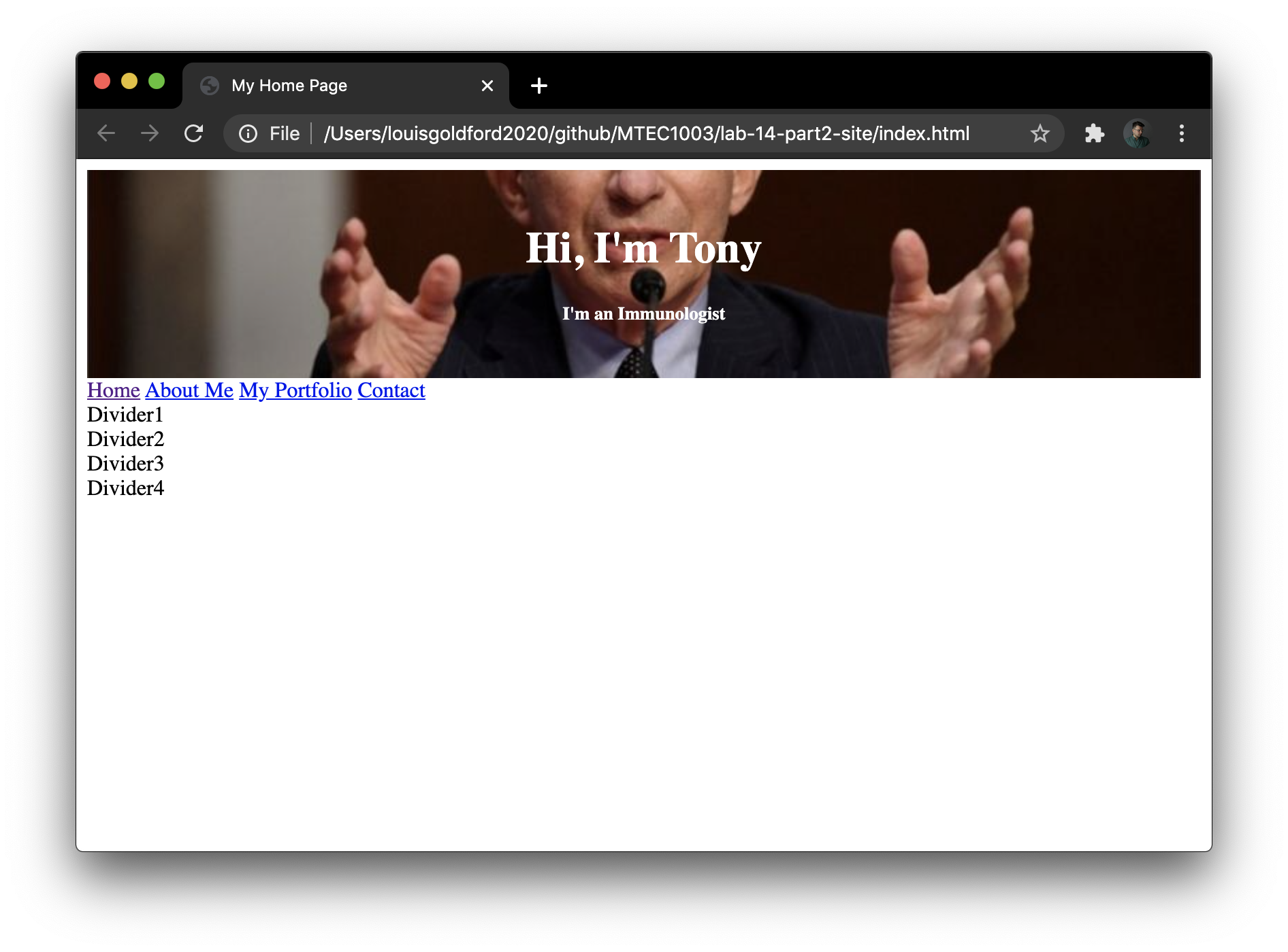
}At this point, open your index.html file in Chrome to observe the current state of your home page. It should appear extremely plain, without almost no styling at all:
Make sure your files are all included in your /lab-14-site repo, and don’t forget to add, commit, and push your changes!
4. Extracting Your Site’s Color Scheme from a Photo
To get colors for our HTML elements, we’re going to use a free feature on Adobe Color’s site.
First, go here: Extract color from an image
Drag and drop the image fauci.v01.jpg onto the page. The site will return a “swatch” of prominent colors found in the image you upload. And most importantly for us… their hex numbers (near the bottom of the screen):
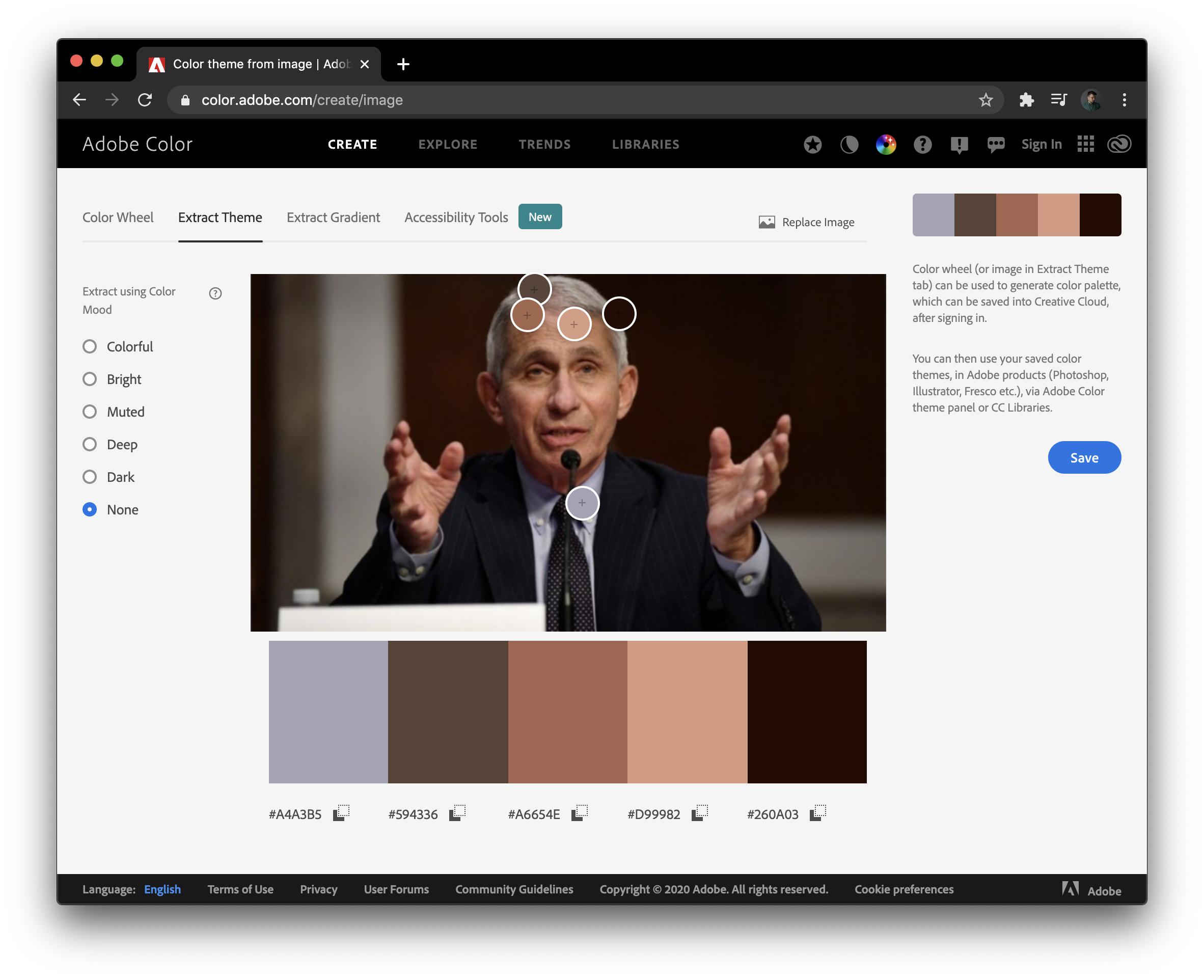
We can use these 5 hex values to color things on our site like body text, headers, background colors, buttons, etc. Because of their association to the image, we can give our web pages a greater sense of design coherence by coordinating these colored elements into a color “theme.”
In the next section, we’ll copy these hex values into our external style sheet.
Make sure your files are all included in your /lab-14-site repo, and don’t forget to add, commit, and push your changes!
5. Styling the Divs
Setting Global and Unique CSS Rules
Previously, we’d assigned class selectors and ID selectors to each <div> element below our navbar.
Now we’ll use these selectors to give our divs unique properties.
In your CSS, let’s first define some global properties — that all our divs will have in common.
Remember: our class selector for these particular divs is “stuff”. Type the following:
div.stuff {
  width: 250px;
  /* height: fit-content; */
  word-wrap: break-word;
  overflow: auto;
  text-align: left;
  border-width: 1px;
  border-style: dotted;
  border-color: black;
  float: left;
  margin: 10px;
  padding: 5px;
}
The selector div.stuff will therefore set rules for any <div>s with the class selector .stuff.
First we set the width: property to 250px — in other words, each div will be a column 250 pixels wide. Notice that the height: property is commented out. I left this commented out so you’d notice it was missing! Instead, we’ve defined the word-wrap: property and set its value to break-word, and we’ve given the overflow: property a value of auto. These will ensure the size of our divs will conform to the size of their contents. So, if we put 3 paragraphs (<p></p>) of text inside one div, and then 5 paragraphs inside another, then each div will only take up the amount of space needed for each block of paragraph text. You’ll see this in action when we load our divs up with body text later…
But for now, remember that these properties are global and will apply to all of our divs grouped together into the class “stuff.”
Next, let’s define unique properties for each div, defined by their individual ID selectors.
Set up ID selectors for each one in your CSS. Leave them “blank” for now; don’t write any rules yet:
div#first {

}

div#second {

}

div#third {

}

div#fourth {

}

div#fifth {

}
Let’s give each <div> its own background color. And, let’s use the 5 colors extracted from our “hero image” in the last section.
For each of these ID selectors, set a rule for background-color: and set it equal to one of the hex values returned to us by the Adobe Color website:
div#first {
background-color: #A4A3B5;
}
div#second {
background-color: #594336;
}
div#third {
background-color: #A6654E;
}
div#fourth {
background-color: #D99982;
}
div#fifth {
background-color: #260A03;
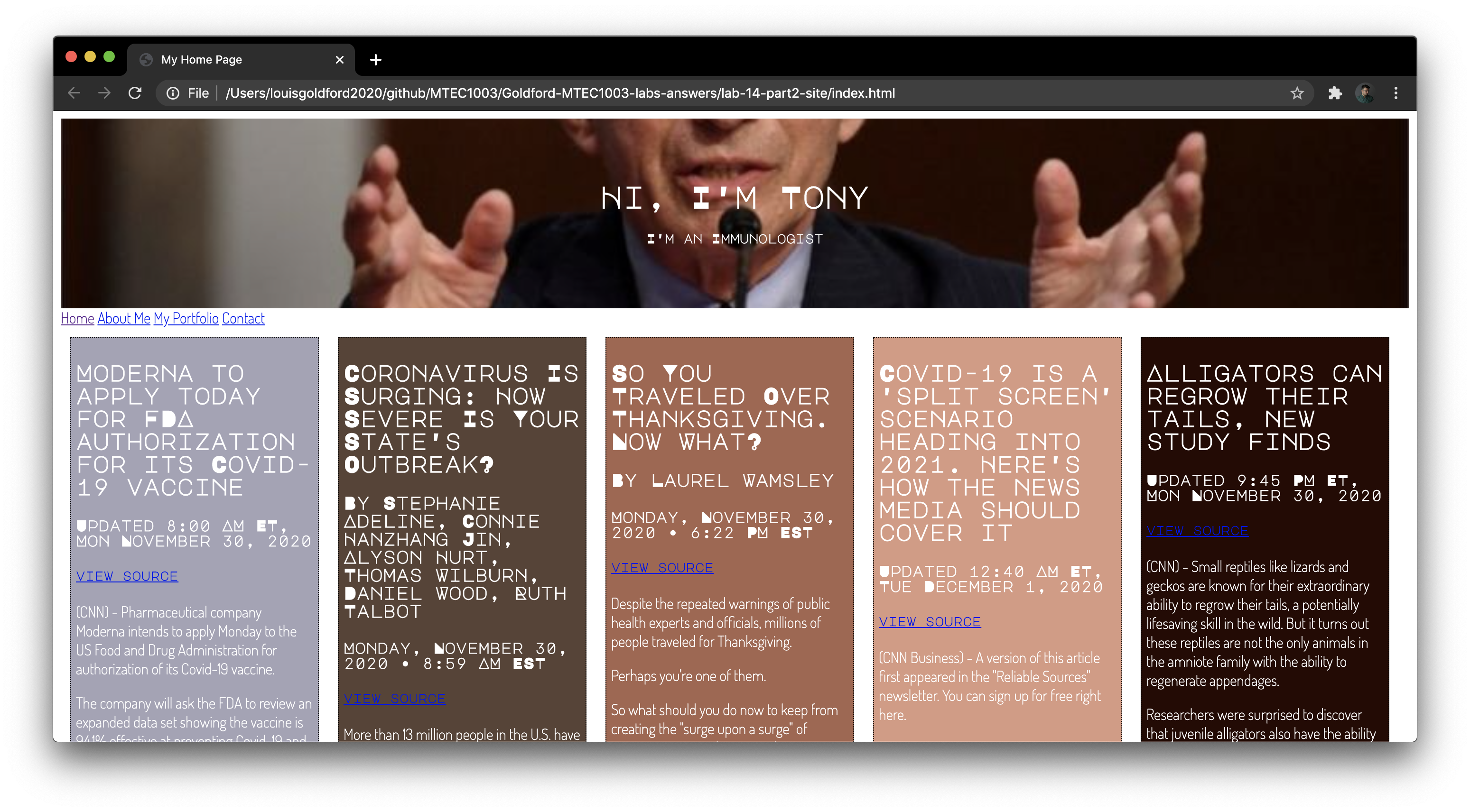
}Refresh your index.html page, and immediately you should see the following changes:
- The divs are now horizontal instead of stacked on top of each other, thanks to the
float: left;rule in thediv.stuffselector. - Each div has a border and a unique background color.
- The size of the div wrapped around each block of text is only as big as the text contained in the div. Right now they’re all the same, but let’s give them differing amounts of text in each one…
Adding Dummy Text to Each Div
Let’s replace the simple contents of each div (“Divider1”, “Divider2”, etc.) with some news articles.
The following text-only news stories have been prepared for you with the proper HTML tags; they’re ready to copy and paste inside your index.html file. For example, click on the following link for the first story:
…then highlight the entire text file (on Mac: command + A) and copy the entire story (command + C).
In your index.html file, navigate to line 21:
<div class="stuff" id="first">Divider1</div>Highlight the current placeholder text (“Divider1”) and replace this text by pasting the pre-formatted news article currently on your clipboard (command + V).
Clean up the result by properly indenting the contents of the div.
Your new div should look like this, beginning on line 21:
<div class="stuff" id="first">
  <h2>Moderna to apply today for FDA authorization for its Covid-19 vaccine</h2>
  <h4>Updated 8:00 AM ET, Mon November 30, 2020</h4>
  <h5><a href="http://lite.cnn.com/en/article/h_8a9d29406e73343797dbac1d4a23586c" target="_blank">view source</a></h5>
  <p>(CNN) - Pharmaceutical company Moderna intends to apply Monday to the US Food and Drug Administration for authorization of its Covid-19 vaccine.</p>
  <p>The company will ask the FDA to review an expanded data set showing the vaccine is 94.1% effective at preventing Covid-19 and 100% effective at preventing severe cases of the disease.</p>
  <p>"This is striking," said Dr. Paul Offit, a member of the FDA's vaccine advisory committee. "These are amazing data."</p>
  <p>Moderna's chief medical officer said he became emotional when he saw the data Saturday night.</p>
  <p>"It was the first time I allowed myself to cry," Dr. Tal Zaks said. "We have a full expectation to change the course of this pandemic."</p>
  <p>Moderna will become the second company to apply to the FDA for emergency use authorization for a coronavirus vaccine. Pfizer applied on November 20 with data showing similarly high efficacy.</p>
  <p>The FDA will meet with its advisory committee in December to review Pfizer's and Moderna's applications.</p>
  <p>The first vaccinations in the United States are expected to take place "towards the latter part of December," according to Dr. Anthony Fauci, director of the National Institute of Allergy and Infectious Diseases.</p>
  <p>Moderna's new data</p>
  <p>On Monday, Moderna released updated efficacy data for its Phase 3 clinical trial.</p>
  <p>Starting in July, Moderna gave either its vaccine or a placebo -- a shot of saline that does nothing -- to some 30,000 people in the United States. With high rates of coronavirus throughout the country over the next following months, many of those study subjects developed Covid-19.</p>
  <p>But there was a big difference between the group that got the vaccine and the group that got the placebo.</p>
  <p>Among the approximately 15,000 people who received the vaccine, 11 developed Covid-19.</p>
</div>
Now, repeat these steps for each of the remaining 4 divs…
Use the following links to copy unique text (i.e. news articles) and paste them inside each div:
Once you’ve copied in all this text, refresh your index.html page, scroll down and notice that each div has a different size. This is because instead of setting their height: properties to the same value (in our CSS), we instead invoked the word-wrap: break-word; rule, ensuring that each div would only require the amount of space needed for its contents!
Now, when you scroll down the divs should all have different heights.
Make sure your files are all included in your /lab-14-site repo, and don’t forget to add, commit, and push your changes!
6. Using Google Fonts
You may notice there are some problems with our body text…
First of all, our font is really boring! Let’s “spice up” our page by using more interesting and designer-friendly fonts. Also, the black text looks awful against these colored backgrounds!
So, start by clicking here to visit Google Fonts.
Browse the font collections here. You can use any of the licensed fonts in your page!
Let’s choose 2 fonts: one for good looking headers, and another for body text…
In the search bar in the upper left, type “Major Mono Display” and click on the font of the same name, which comes up as a result.
On the next page, find the “Regular 400” weight font on the page and click the “+ Select this style” button next to it.
Then, hover over the icon in the upper right corner of the page, where a floating windows appears reading, “View your selected families”. Click this icon and observe the right sidebar that comes up:
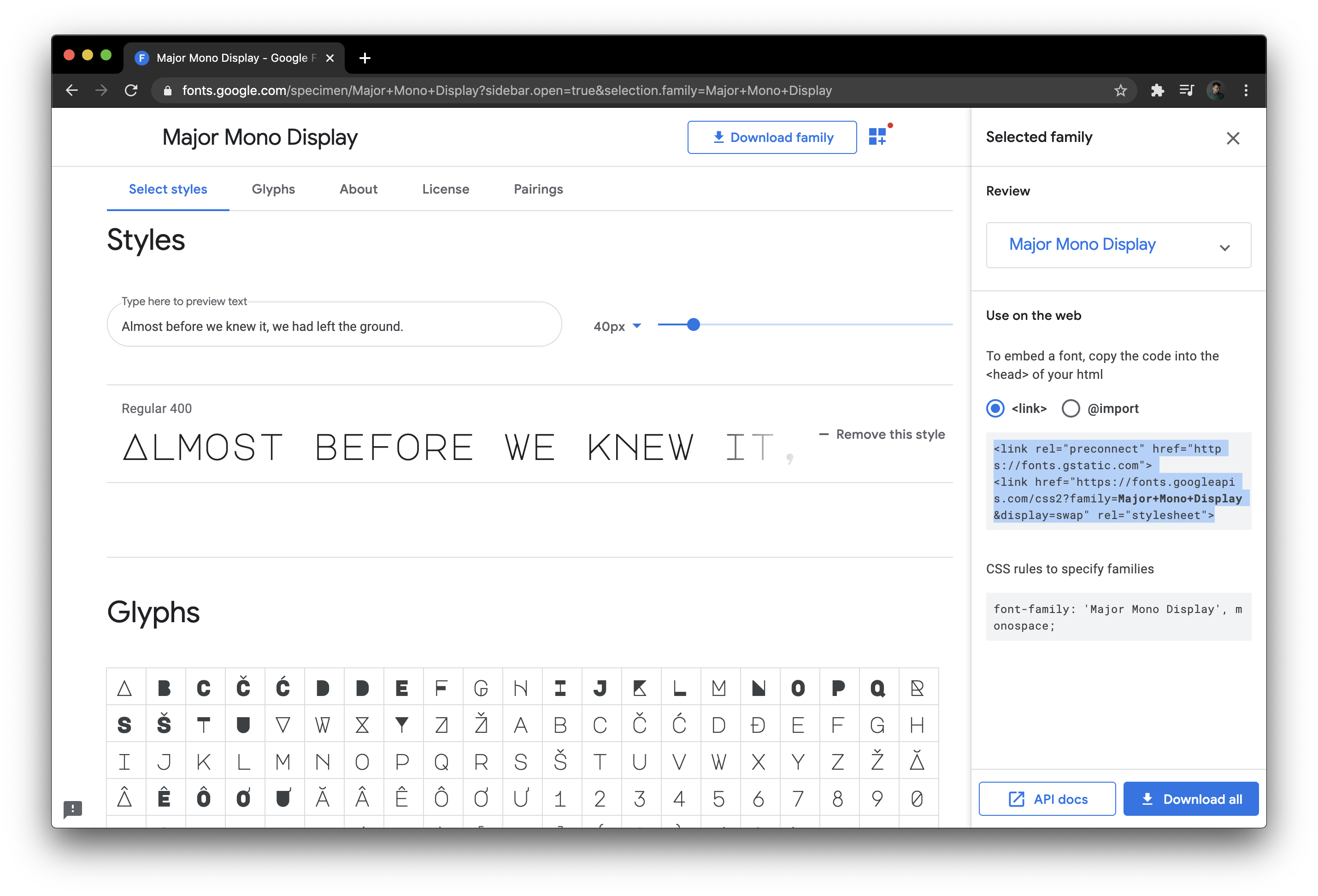
Notice that the right sidebar contains pre-formatted HTML and CSS code that you can copy into your own website!
Before we copy anything, let’s add one more font to use on our website.
Click again on the “Browse Fonts” tab at the top of the page, and in the search bar in the upper left, this time type “Dosis” and click on the font family that shows up as a result.
On the next page, click on some of the “lightweight” fonts within the font family to add them to your selection. We’ll use this font for body text, so lighter weights are preferred. For example, click on “+ Select this style” for 2 or 3 of the fonts listed; try the 200, 300, and 400 styles.
If the right sidebar disappeared, reopen it by click on the icon in the upper right corner.
Your selection should look like this:
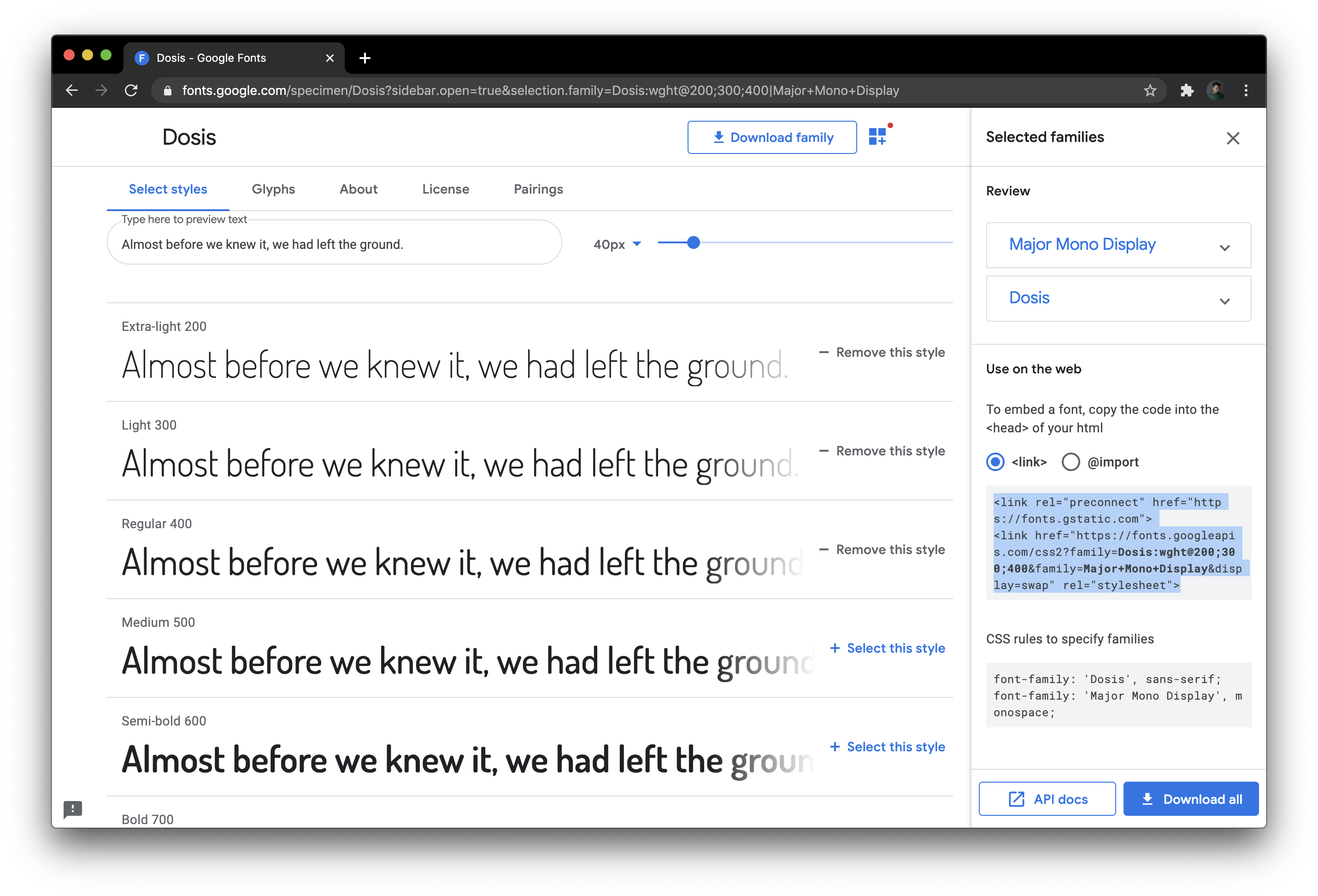
Highlight the HTML code in the center of the right sidebar (in the screencap above, this currently highlighted in blue). Copy the code (command + C).
Now, go back to the <head> of your index.html file. Paste this code inside the <head>, below the link to your CSS style sheet beginning on line 7. These 2 new lines of code from Google Fonts will allow you to use the font in your page. Your updated HTML <head> will now resemble this:
<!DOCTYPE html>
<html>
  <head>
    <meta charset="utf-8">
    <title>My Home Page</title>
    <link rel="stylesheet" href="style.css">
    <link rel="preconnect" href="https://fonts.gstatic.com">
    <link href="https://fonts.googleapis.com/css2?family=Dosis:wght@200;300;400&family=Major+Mono+Display&display=swap" rel="stylesheet">
  </head>
Next, let’s style the page with these new fonts using CSS.
Go back to the Google Fonts page and this time highlight + copy the CSS code for the Dosis font, pictured towards the bottom of the right sidebar, under “CSS rules to specify families”:
font-family: 'Dosis', sans-serif;In your style.css file, at the top, paste this font-family rule inside inside the combined html, body selectors. Choose a light font-weight for your body text: try 200. Also, use this opportunity to create a color rule that applies the value white to all body text. Adapt the top of your CSS code so that is resembles this:
/* universal properties */
body, html {
    height: 100%;
    font-family: 'Dosis', sans-serif;
      /* font-family rule copied from Google Fonts */
    font-weight: 200;
    color: white;
}
Now, all body text will have color value white, and will be styled using the Dosis font family at font weight of 200.
Let’s use our other chosen font, Major Mono Display, for all headers.
To do this, we just create another rule that applies to all our headers, <h1> through <h6>.
So, adapt your CSS once again to include the following rule:
/* use Major Mono Display for all headings h1—h6 */
h1, h2, h3, h4, h5, h6 {
  font-family: 'Major Mono Display', monospace;
    /* font-family rule copied from Google Fonts */
}
Now, the headers all over your site will have the same font.
In Chrome, refresh your index.html page once again and note the changes in style:
…It’s starting to look pretty good!
Make sure your files are all included in your /lab-14-site repo, and don’t forget to add, commit, and push your changes!
7. Styling the Navbar
We’re almost done!!
The navbar is still looking pretty plain. How would you like to have a navbar that “sticks” to the top of the page even when you scroll down past it?
To accomplish this, we’ll be using a combination of CSS and JavaScript. We’ll be adapting code from this tutorial on creating “sticky” navbars.
First, recall the navbar elements we wrote in our HTML source, on lines 17-22 just under the hero image containers:
<div id="navbar">
  <a href="index.html">Home</a>
  <a href="aboutme.html">About Me</a>
  <a href="myportfolio.html">My Portfolio</a>
  <a href="contact.html">Contact</a>
</div>
We have a container with ID selector “navbar”, which contains 4 href links to other pages on our site.
Go to your style.css document. Add the following style rules:
/* Style the navbar */
#navbar {
  overflow: hidden;
  background-color: #260A03;
}

/* Navbar links */
#navbar a {
  float: left;
  display: block;
  color: #f2f2f2;
  font-family: 'Major Mono Display', monospace;
    /* font-family rule copied from Google Fonts */
  text-align: center;
  padding: 14px;
  text-decoration: none;
}
Here, we address global navbar properties by targeting the ID selector #navbar. Then, we target just the links alone by invoking #navbar a. These style rules provide some simple coloring and display options. Notice that we’re including the font-family rule copied out from Google Fonts!
Next, imagine that we want the navbar links to have a different color when we hover over them. To do this, add another rule that changes the color of the text when you hover over the navbar links:
/* Change color + highlight on hover. */
#navbar a:hover {
  color: hotpink;
  background-color: white;
}
And finally, add the following rules to your CSS to help us manage the “sticky” behavior of the navbar. These next 2 rules will interact with the JavaScript we write next, in order to make the navbar stay at the top of the page when we scroll down…
/* The sticky class is added to the navbar with JS when it reaches its scroll position */
.sticky {
  position: fixed;
  top: 0;
  width: 100%;
}

/* Add some top padding to the page content to prevent sudden quick movement (as the navigation bar gets a new position at the top of the page (position:fixed and top:0) */
.sticky + .content {
  padding-top: 60px;
}
Now, return to your HTML source. We need to write a bit of JavaScript to make the “sticky” part work. So, scroll down to the bottom of your HTML, and in between the final closing </div> tag and the closing </body> tag, open up <script></script> tags and type the following:
<script src="navbar.v01.js"></script>Here, we’re referencing an external file called navbar.v01.js, which we’ll use to write some JavaScript and help our navbar “stick” to the top of the page. (Note: Typically we’ve been writing the JavaScript itself between the <script> tags, but in web design it’s typical to write the JavaScript in a separate, external file referenced in the script tag this way. This just helps keep our code organized!)
It’s time to write our JavaScript! Make a new file in your text editor and save it as navbar.v01.js. Be sure the file is saved in your local repo, along with your index.html and style.css files! They all must be in the same directory level in order to work!
Enter the following JS code into your file and save it:
1
2
3
4
5
6
7
8
9
10
11
12
13
14
15
16
17
18
// source: https://www.w3schools.com/howto/howto_js_navbar_sticky.asp
// When the user scrolls the page, execute myFunction
window.onscroll = function() {myFunction()};

// Get the navbar
var navbar = document.getElementById("navbar");

// Get the offset position of the navbar
var sticky = navbar.offsetTop;

// Add the sticky class to the navbar when you reach its scroll position. Remove "sticky" when you leave the scroll position
function myFunction() {
  if (window.pageYOffset >= sticky) {
    navbar.classList.add("sticky")
  } else {
    navbar.classList.remove("sticky");
  }
}
Notice on line 12: we’re writing a funtion that creates the class “sticky” and adds it to the navbar “object” (i.e. the HTML element we called “navbar”). This is done with a conditional statement — We add the class when the scroll position reaches its scroll position (lines 13-14), and if the value of the scroll height is not greater than our limit, we’ve coded an else branch to remove the sticky class (lines 15-16). In our CSS, we added a rule to the .sticky class selector, which pins the navbar’s position to the top of the page, in a fixed position.
To see this in action, refresh your index.html page once more, and scroll up and down the page. Notice how the navbar remains at the top of the page, even as you scroll down to read the news articles!
Also, take notice of the behavior of the navbar when you hover over the links. They change colors and are highlighted according to the CSS rules we wrote!
Make sure your files are all included in your /lab-14-site repo, and don’t forget to add, commit, and push your changes!
8. Linking New Pages
Now that you’ve made the home page with all of your preferred design elements, you can quickly & easily reuse them on any other pages you write for your site!
Think of all this hard work you’ve done on the home page as recyclable: you’ve just made a template, and you’ll reuse the same design elements on your other pages in order to keep things organized and and maintain the look of your new site…
So, bring up your index.html home page, which we’ll use as a template for the other linked pages.
Recall the navbar links once more on lines 17-22:
<div id="navbar">
  <a href="index.html">Home</a>
  <a href="aboutme.html">About Me</a>
  <a href="myportfolio.html">My Portfolio</a>
  <a href="contact.html">Contact</a>
</div>
This means we need 3 more pages with the names provided in the links above.
Save a copy of your index.html file and name is aboutme.html.
In this new file, delete everything after the first “stuff” div until the <script> tag at the bottom of the page (for styling the navbar). This should be approximately lines 41-143.
Now, delete the news article contained in that first div. This should be approximately lines 24-39.
In place of this news article, enter some dummy text to identify your “About Me” page.
Write in an <h2> heading identifying the page.
Then, change the HTML document title on line 5 from “My Home Page” to “About Me”.
Your entire “About Me” page can simply look like this:
1
2
3
4
5
6
7
8
9
10
11
12
13
14
15
16
17
18
19
20
21
22
23
24
25
26
27
28
29
30
<!DOCTYPE html>
<html>
<head>
<meta charset="utf-8">
<title>About Me</title>
<link rel="stylesheet" href="style.css">
<link rel="preconnect" href="https://fonts.gstatic.com">
<link href="https://fonts.googleapis.com/css2?family=Dosis:wght@200;300;400&family=Major+Mono+Display&display=swap" rel="stylesheet">
</head>
<body>
<div class="hero-image">
<div class="hero-text">
<h1>Hi, I'm Tony</h1>
<h5>I'm an Immunologist</h5>
</div>
</div>
<div id="navbar">
<a href="index.html">Home</a>
<a href="aboutme.html">About Me</a>
<a href="myportfolio.html">My Portfolio</a>
<a href="contact.html">Contact</a>
</div>
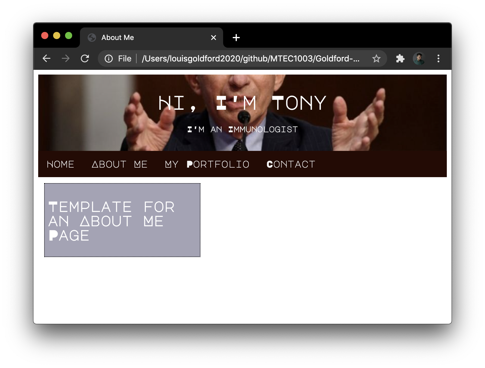
<div class="stuff" id="first">
<h2>Template for an About Me Page</h2>
</div>
<script src="navbar.v01.js"></script>
</body>
</html>
Notice the new <h2> heading we wrote on line 24. It’s the only element contained in the first “stuff” <div>, but you can recycle any or all of the design elements to create other divs, add more content (such as your biography or resume, etc.) and just have fun with it!
Now, from your index.html home page, click on “About Me” in your navbar, and observe the new page:
Click on the “Home” link in your navbar, and it returns to your Home Page. It works!
Repeat these steps for each of the remaining 2 pages — make a simple template like this for your “My Portfolio” and “Contact”.
Just make sure the file names for each page exactly match the links written in the navbar!
NOTE ABOUT YOUR FINAL ASSIGNMENT: Your final project (i.e. personal website) can use this same navbar and linked pages template. Save new copies of these files and place them into your own repository. Change the color schemes, photos, fonts, and contents to match your own desired personal website elements. Add animation and/or JS canvas drawing, your own biography text, your own portfolio items (e.g. photos and videos of your own projects), styling rules, contact information, etc. Use this website as a template — don’t start over from scratch, which will take far more time! And of course, be sure to how your own site on GitHub Pages according to the lessons learned in Lab 14 / Part 2.
9. Pushing Your Site to GitHub Pages
Once you’ve built your website and tested it in Chrome, it’s time to push the site to a remote server.
We’ll use GitHub Pages as the server hosting our website. (For free!)
First, in your Terminal, make sure your commits are current, and that you’ve pushed your latest changes. Run git status to be sure your git is current:
$ git status
On branch master
nothing to commit, working tree clean
$
Notice it first reminds you that you’re working on the branch called master. Let’s make a new branch, which we’ll call “gh-pages”, and push our changes here. In order to host our websites on GitHub Pages, we need to push our site to a branch with this exact name. Run the git checkout below as shown to create this new branch:
$ git checkout -b gh-pages
Switched to a new branch 'gh-pages'
$
Verify that you’re currently working on the new branch gh-pages:
$ git branch
* gh-pages
  master
$
So now you’re working on gh-pages. That’s good. Our next step is to git rebase our previous commits — which is a little bit like git merge — migrating our code from the master branch into the new gh-pages branch:
$ git rebase master
Current branch gh-pages is up to date.
$
To get our code from the master branch to the gh-pages branch, we use git rebase instead of git merge in order to maintain a linear commit history, as described by this article.
Now all that’s left to do is to push our changes to the new gh-pages branch:
$ git push origin gh-pages
Total 0 (delta 0), reused 0 (delta 0)
remote:
remote: Create a pull request for 'gh-pages' on GitHub by visiting:
remote:      https://github.com/yourUserName/lab-14-site/pull/new/gh-pages
remote:
To https://github.com/yourUserName/lab-14-site.git
 * [new branch]      gh-pages -> gh-pages
$
Notice that you typed git push origin gh-pages instead of the familiar git push origin master. In order for this to work, you must push to gh-pages! If you push to master, you won’t see your site appear on GitHub.
Now, visit your GitHub repository. We’ve just created a new branch that now appears in your GitHub repo, and this gh-pages branch will be where the site is hosted. To visit the site, make a small change to your web address… The address to your repository probably looks something like this:
https://github.com/yourUserName/lab-14-site
All you have to do is slightly rearrange this address in order to view the site you just pushed:
https://yourUserName.github.io/lab-14-site/
As always, use your “actual” GitHub username in place of “yourUserName”.
When the page loads, you should see you site at your unique GitHub address!
It may not load immediately if you’ve just pushed your site. If so, wait a few minutes while the page uploads (this could take several minutes…), and then refresh your webpage.
So, to summarize: whenever you want to make further changes to your site, run the following commands:
$ git status
$ git add --all
$ git commit -m "i changed x, y, and z."
$ git push origin gh-pages
$
Always remember to git push origin gh-pages in order to see your changes on your website hosted at GitHub Pages!
At the end of this lab, your /lab-14-site repo should contain the following 7 files:
- index.html
- style.css
- fauci.v01.jpg
- navbar.v01.js
- aboutme.html
- myportfolio.html
- contact.html
Make sure all files are all included in your /lab-14-site repo, and don’t forget to add, commit, and push your changes!